Tuesday, 12 January 2010
Friday, 8 January 2010
Evaluations
1) What ways does you media product use, develop or challenge forms and conventions of real media products?
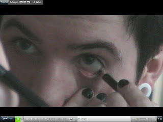
Filming in a mirror in big close up.
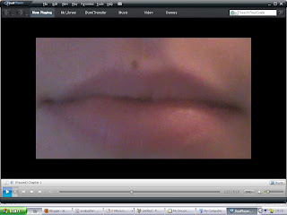
Extreme close up.
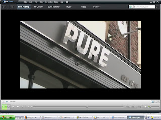
Establishing shot.
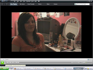
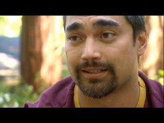
Body shock:Age 8 and Wanting a Sex Change -
channel 4 - http://www.channel4.com/programmes/bodyshock/4od#3009991

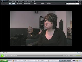
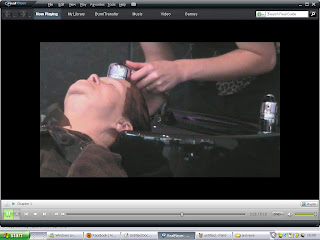
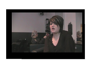
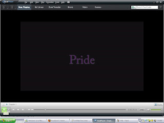
Our documentary- 7 Deadly Sins - Pride
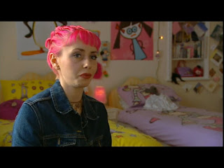
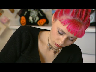
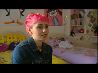
A to Z of your head: Channel 4 - http://www.channel4.com/programmes/a-z-of-your-head/4od#2917458
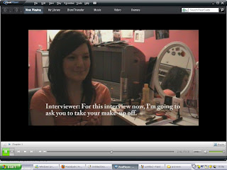
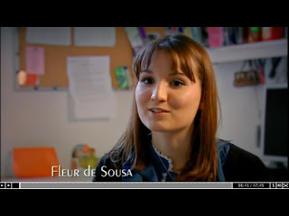
Teens and Tiaras: channel 4 -
http://www.channel4.com/programmes/teens-and-tiaras/4od#3018074
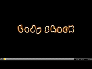
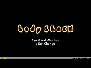
Body shock:
Age 8 and Wanting a Sex Change -
channel 4 - http://www.channel4.com/programmes/bodyshock/4od#3009991
2) how effective is the combination of the main task and the ancillary task?
The documentary, print advert and radio trailer are all linked to each other to create the final package. The slogan ‘ what’s your poison?’ is the print advert and the radio trailer. This links them together also posing a question to the audience which will later be answered in the programme itself.
The song ‘Bodies’ by Robbie Williams is in both the documentary and the radio trailer linking them both together. We used this song as the programme is on pride which is also known as vanity and the song worked well portraying the subject of the documentary.
The same voiceover was used for the documentary and the radio trailer. It is standed English and is informal which is suitable for the target audience. The voiceover is of the same age range as the target audience.
We followed the codes and conventions of Channel 4 adverts, the print advert is landscape this is because it can be used in different sizes and also on billboards. It is of a poison bottle. We chose the bottle as poison is a sign of danger and death as are sins. The drops of poison relate to the fact that the documentary is a series and Pride being the biggest as it is the first in the series.
On each of the radio trailer and the print advert the scheduling of the programme is advertised the date, time and channel, we chose 9pm as it is more age appropriate for an audience of 16-25. The print advert was to be published in broadsheet newspapers like the telegraph and the radio trailer of local and nationalcommercial radios stations such as radio city and Heart fm.
3)What have you learned from your audience feedback?
We followed out our audience feedback by a foucus group of 15 people in our target audiance range. We showed them our products, we then asked them questions. I also conducted some one to one interviews outside of the focus group.
1) From the first 5minutes of the documentary does it make you want to watch the rest ?
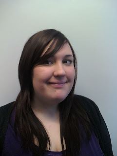 Jordan Grisenthwaite
"Yes because the idea of the documentary is really original"
Outside of the classroom I asked 11 people if they would consider watching the rest of the documentary and 100% said yes they would. I took it home and showed my family and 90% said they would and 20% said that they wouldn’t when asked why they said.
Documentaries are not my thing
2) what are were the strengths and weaknesses of our documentary
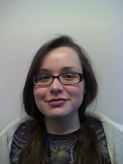 Rachel Smith
3) Listening to the radio trailer does it make you want to watch the rest?
4) does the print advert interest you in the documentary ?
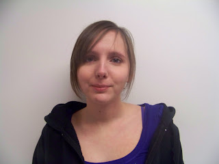 Chelsea Kenyon
"yes as is really like the idea of the poison bottle I think it is very creative"
 DV camera, Tripod and clip on microphone - Were used to film the documentary and interviews.
Stills camera- was used to create the print advert and pictures for my blog
Dictorphone- was used for my audience research and feedback.
Photoshop - was used to create the print advert
Adobe premiere - was used to edit the documentary and radio trailer.
Ice radio studio - was used to record the voice over for the documentary and the radio trailer.
 Internet- we also used the internet for research and ahcieve material
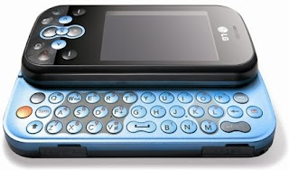 Moblie - i used my moblie for pictures
- We didn’t develop nor challenge real media products but, use them to create our own documentaries.
- The narrative structure of our documentary was single strand and non-linear, this makes it simple and easy for the audience to understand, the narrative is informal which makes it right for the target audience of 16-25.
- Different types of shots were used in the documentary. Close ups, establishing shots, panning was used, extreme close ups, also using a shot in a mirror

Filming in a mirror in big close up.

Extreme close up.

Establishing shot.
- Camera movements such as panning and zoom where used.
- The framing of the interviews was to the left or the right hand-side, making sure that the eye-line was 1/3 of the way down the screen.


Body shock:Age 8 and Wanting a Sex Change -
channel 4 - http://www.channel4.com/programmes/bodyshock/4od#3009991

- We used cutaways during the interviews this avoids jump cuts. We also made sure that the mise-en-scene of the cutaway was relevant to the interview.


Our documentary- 7 Deadly Sins - Pride


A to Z of your head: Channel 4 - http://www.channel4.com/programmes/a-z-of-your-head/4od#2917458
- The voiceover matched our target audience this will help the audience become involved, the voice over links and holds the structure of the programme together so it is important that we use standard English.
- Mise-en-scene is used during interviews making sure that it relates to the subject being discussed, this anchors the audiences attention. Mise-en-scene is used though out the documentary, the mise-en scene also related to what it voice over is saying in our cutaways.
- Graphics are used during the title sequence as well as thoughout the documentary.
- Graphics were used to understand what was being asked to the interviewee in one of our interviews because we needed to hear the question as the interviewer wasn't wearing a mic.
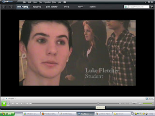
- Graphics are used on the opposite side of the screen to the interviewee at the beginning of an interview. They anchor who the person is and their relevance to the topic.


Teens and Tiaras: channel 4 -
http://www.channel4.com/programmes/teens-and-tiaras/4od#3018074

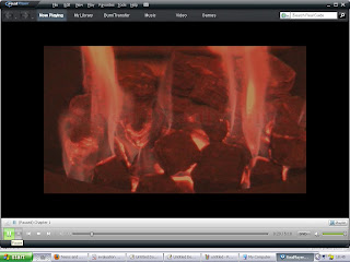
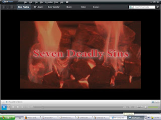
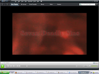
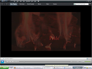
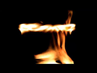
- Our title sequence was creative and unique, using the fire as a symbol of deadly things. We used cross dissolves to create an effect of going in the fire and the flashing words. We changed the colour of the fire to create a better impact.


Body shock:
Age 8 and Wanting a Sex Change -
channel 4 - http://www.channel4.com/programmes/bodyshock/4od#3009991
- The music that was used in the documentary was, ‘Bodies’ by Robbie Williams, ‘Down’ Blink 182 and ‘Filthy gorgeous’ by the scissor sisters. They were relevant to the subject for each of the different interviews and they were kept as background music at a minimum level.
2) how effective is the combination of the main task and the ancillary task?
The documentary, print advert and radio trailer are all linked to each other to create the final package. The slogan ‘ what’s your poison?’ is the print advert and the radio trailer. This links them together also posing a question to the audience which will later be answered in the programme itself.
The song ‘Bodies’ by Robbie Williams is in both the documentary and the radio trailer linking them both together. We used this song as the programme is on pride which is also known as vanity and the song worked well portraying the subject of the documentary.
The same voiceover was used for the documentary and the radio trailer. It is standed English and is informal which is suitable for the target audience. The voiceover is of the same age range as the target audience.
We followed the codes and conventions of Channel 4 adverts, the print advert is landscape this is because it can be used in different sizes and also on billboards. It is of a poison bottle. We chose the bottle as poison is a sign of danger and death as are sins. The drops of poison relate to the fact that the documentary is a series and Pride being the biggest as it is the first in the series.
On each of the radio trailer and the print advert the scheduling of the programme is advertised the date, time and channel, we chose 9pm as it is more age appropriate for an audience of 16-25. The print advert was to be published in broadsheet newspapers like the telegraph and the radio trailer of local and nationalcommercial radios stations such as radio city and Heart fm.
3)What have you learned from your audience feedback?
We followed out our audience feedback by a foucus group of 15 people in our target audiance range. We showed them our products, we then asked them questions. I also conducted some one to one interviews outside of the focus group.
1) From the first 5minutes of the documentary does it make you want to watch the rest ?
- Yes it would
- Yes, because it is not everyday you see a lad talking about makeup
- Yes, because it looked really interesting
 Jordan Grisenthwaite
Outside of the classroom I asked 11 people if they would consider watching the rest of the documentary and 100% said yes they would. I took it home and showed my family and 90% said they would and 20% said that they wouldn’t when asked why they said.
Documentaries are not my thing
- Its not really something that I would intend to watch
- I wouldn’t watch it unless there was nothing else on the TV, I’m just not a fan for documentaries
2) what are were the strengths and weaknesses of our documentary
- A strength is that it is an original idea
- There is a boy in it talking about makeup that makes it interesting
 Rachel Smith
"camerawork is good in interviews and cutaways
Interviewees are natural in front of a camera"
- Music is too loud in some parts bit windy in some parts
- Some of the interviews are a little short
3) Listening to the radio trailer does it make you want to watch the rest?
- Yes, but the music was too loud sometimes
- Yes because it was fast paced sometimes and it caught my attention
- Yes because it sounds interesting
- Yes I like the whispering in the trailer and the facts on pride

Radu Taga
Studant
"I like the snippets of the documentary and it makes me wonder what the documentary is like."
4) does the print advert interest you in the documentary ?
 Chelsea Kenyon
"yes as is really like the idea of the poison bottle I think it is very creative"
- Yes I like the fact that the sins in the droplets
- Yes I like the print I like that it portrays a kind of danger as does the sins
- It compared really well to the ones on the tv, I think it is good enough to be broadcast on channel 4
- I think that if it was showed on the TV people would not be able to tell that it was created for coursework
- I was an original idea
- The interviews were very good
- The cutaways were very good
- Compared to a professional documentary it was just as good
 DV camera, Tripod and clip on microphone - Were used to film the documentary and interviews.
Stills camera- was used to create the print advert and pictures for my blog
Dictorphone- was used for my audience research and feedback.
Photoshop - was used to create the print advert
Adobe premiere - was used to edit the documentary and radio trailer.
Ice radio studio - was used to record the voice over for the documentary and the radio trailer.
 Internet- we also used the internet for research and ahcieve material
 Moblie - i used my moblie for pictures
Monday, 14 December 2009
Radio Trailor and Print Advert
As we got to the end of the editing we all split into diffent teams and stated other prohects that needed to be done for the documenary, one of us kept editing the documentary,another started to do the print advert and i was in charge of the radio trailor. Before we could split into the different jobs we had to help with the print advert first. Before we could split into the different jobs we had to help with the print advert first.
Codes and Conventions of a print advert
- One strong key image
- Words kept to a minimum
- Slogan
- Channel logo (prominent)
- Scheduling
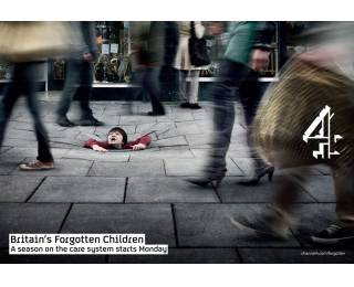
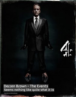
Our first idea for the print advert was a young girl with makeup running down her face, howver we believed that this focuced more on pride then actually telling the audiance that it was a series of documentaies on each sin. We made a list of all the things that could be associated with danger or sins. Eventually we decided on a poison bottle with drips of poison coming out with the name of each sin inside then making Pride the biggest as its the first in the seires and moulding it together with the time, day and channel it would be on.
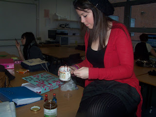
We added golden syrup and red food colouring in a cup and mixed them together, this made the poison.
.
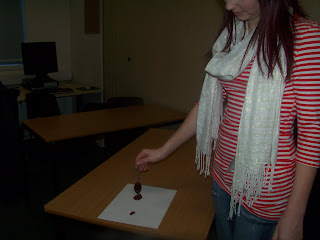
We then dripped it onto the page making sure that it ended in a drop shape to symolise the drops of poison that we would later photoshop and doublicate
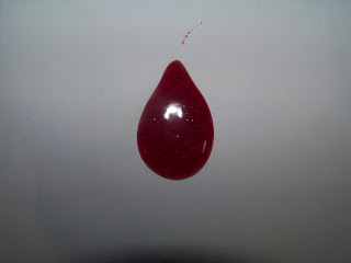
We then dripped it onto the page making sure that it ended in a drop shape to symolise the drops of poison that we would later photoshop and doublicate.After we all worked together to make the drop of posion we all split into separat priorities, one member was in charge of the print advert, one was in charge of fixing the documentary and i was in charge of the radio tralior.
I began coming up with things that would work in the tralior.

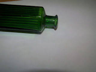
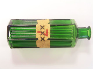
After class a member of the group printed off a piece of paper with xxx7 printed in it, then soaking it in tea and dring it under the dryer she stick it onto the old medican bottle and took some pictures in differnt angles.
Codes and conventions of a Radio tralior
- Extracts from the programme are used
- Voice over- outlining the narrative and posing questions outlined in the programme
- Channel name- last thing you hear
- Scheduling
- Music (aural cue)- gives a hint of the tone and the content
When i had finished with the help of another member of my group we disscussed how we could make it better and more professional.
we came up with this
We then choose who would be our voice over, we decided on a middle aged woman, we found a teacher that fitted the requirements and a member of our group took her into the ice radio recording studio and they recorded the voiceover and the radio tralior.
(whispers) greed, envy, gluttony, wrath, sloth, lust … pride
We’re all guilty of carrying out at least one sin everyday, a lot of the time without even realising it.
This upcoming month, a new series of documentaries dives deep into the depths of each sin and explores just how deadly they are.
Starting with the sin from which all others arise. Pride is the excessive belief in one's own abilities.
What’s your poison?
Seven Deadly Sins: Pride, starting May 10th on 4
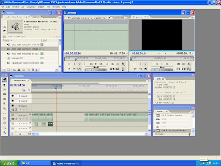
After this we edited the trailer in Adobe Premier Pro, using the slicing tool we cut the trailer into the pieces we needed. we then emurged it all together so it flowed adding voice clips of the interviews from the documentary. We also included the slogan ' whats your poison' the date, time and the channel last following the codes and conventions of a radio trailer advert, By copying and pasting all the whisperd bits in the trailer we managed to create an echo effect to the trailer. After this we put 'Bodies' by Robbie Williams underneath lowering the volume so the voice over could be heard to show the connection between the documentary and the trailer.

Codes and Conventions of a print advert
- One strong key image
- Words kept to a minimum
- Slogan
- Channel logo (prominent)
- Scheduling


Our first idea for the print advert was a young girl with makeup running down her face, howver we believed that this focuced more on pride then actually telling the audiance that it was a series of documentaies on each sin. We made a list of all the things that could be associated with danger or sins. Eventually we decided on a poison bottle with drips of poison coming out with the name of each sin inside then making Pride the biggest as its the first in the seires and moulding it together with the time, day and channel it would be on.


We added golden syrup and red food colouring in a cup and mixed them together, this made the poison.
.


We then dripped it onto the page making sure that it ended in a drop shape to symolise the drops of poison that we would later photoshop and doublicate

We then dripped it onto the page making sure that it ended in a drop shape to symolise the drops of poison that we would later photoshop and doublicate.After we all worked together to make the drop of posion we all split into separat priorities, one member was in charge of the print advert, one was in charge of fixing the documentary and i was in charge of the radio tralior.
I began coming up with things that would work in the tralior.

After class a member of the group printed off a piece of paper with xxx7 printed in it, then soaking it in tea and dring it under the dryer she stick it onto the old medican bottle and took some pictures in differnt angles.
Codes and conventions of a Radio tralior
- Extracts from the programme are used
- Voice over- outlining the narrative and posing questions outlined in the programme
- Channel name- last thing you hear
- Scheduling
- Music (aural cue)- gives a hint of the tone and the content
When i had finished with the help of another member of my group we disscussed how we could make it better and more professional.
we came up with this
We then choose who would be our voice over, we decided on a middle aged woman, we found a teacher that fitted the requirements and a member of our group took her into the ice radio recording studio and they recorded the voiceover and the radio tralior.
(whispers) greed, envy, gluttony, wrath, sloth, lust … pride
We’re all guilty of carrying out at least one sin everyday, a lot of the time without even realising it.
This upcoming month, a new series of documentaries dives deep into the depths of each sin and explores just how deadly they are.
Starting with the sin from which all others arise. Pride is the excessive belief in one's own abilities.
What’s your poison?
Seven Deadly Sins: Pride, starting May 10th on 4
After this we edited the trailer in Adobe Premier Pro, using the slicing tool we cut the trailer into the pieces we needed. we then emurged it all together so it flowed adding voice clips of the interviews from the documentary. We also included the slogan ' whats your poison' the date, time and the channel last following the codes and conventions of a radio trailer advert, By copying and pasting all the whisperd bits in the trailer we managed to create an echo effect to the trailer. After this we put 'Bodies' by Robbie Williams underneath lowering the volume so the voice over could be heard to show the connection between the documentary and the trailer.


After doing this we came up with the voice over, with the help of our teacher we got it right and sounding professional. 00.38.11: Pride the mother of all sins. But just how proud is modern day Britain? Whether it’s not daring to leave the house without guy-liner or fighting in your football teams honour. We examine just how proud is too proud? They say pride comes before a fall.
(15 seconds)
Manda explains the pressure put on young girls to wear make up for school and generally everyday life.
For some people, wearing make up is part of there job description.
In a recent survey, we discovered make up is becoming more common for men.
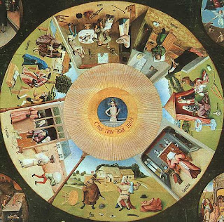
We then edited the voice over into the documentary, we timed the gaps in the documenary and the voice over this helped us determine what we could put into the documentary. After we did this we decided to add a montage of images, displaying to the audiance the different types of pride that we experiance. We gathered the pictures off the internet and then a member of our group filmed them to make the qualirty of the picture better. Adding them into the documentary.
The teacher then watched it, he gave us a few corrections to make and more vocie over ideas, we then asked the women we choose for our voice over if she would record a few more things for us and then set to work on the corrections that were set.
When we had finished all the corrections that the teacher advised to us, our teacher burned the documentary, and radio tralior onto a CD.
We then used one of our lessons for audiance feedback.
(15 seconds)
Manda explains the pressure put on young girls to wear make up for school and generally everyday life.
For some people, wearing make up is part of there job description.
In a recent survey, we discovered make up is becoming more common for men.
We then edited the voice over into the documentary, we timed the gaps in the documenary and the voice over this helped us determine what we could put into the documentary. After we did this we decided to add a montage of images, displaying to the audiance the different types of pride that we experiance. We gathered the pictures off the internet and then a member of our group filmed them to make the qualirty of the picture better. Adding them into the documentary.


The teacher then watched it, he gave us a few corrections to make and more vocie over ideas, we then asked the women we choose for our voice over if she would record a few more things for us and then set to work on the corrections that were set.
When we had finished all the corrections that the teacher advised to us, our teacher burned the documentary, and radio tralior onto a CD.
We then used one of our lessons for audiance feedback.
Editing
The first thing that we noticed while editing was that the documentaries beginning seqance of the differnt pride signs wasn't all taht good so we dicided to make the begging sequance with a fire and make the rest of the sequance ourselves on Adobe.
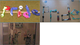


We made each sin flash up as it is a series of documentaires making pride fade into the fire. Changing the colour of the fire, to make it seem more deadly and also to make it look different, we needed it to be a colour that did'nt clash with red as 7 DEADLY SINS is written in red, so we chose an orange colour as the two colours go without it being to much. Then fading the fire into black and Pride fading in, we choose purple as it is the traditional colour of pride accoring to our reasearch.
We edited the Vox Pops that we filmed in Liscard, making them better and then also used these in our beginning sequance. We used them at the very begginning of the title sequance. We did this in order to grab the audiances attension.
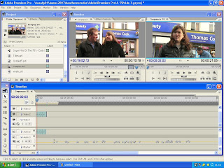
After this we began to edit Amanda's interview cutting out the questions just leaving the answers avioding jump cuts.During Amanda's interview we decided to use the boots cutaway so we edited it down to fit into the interview, we also speeded it up.
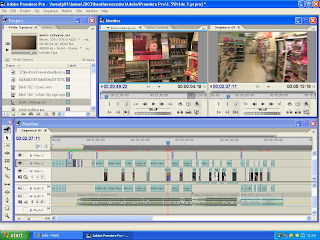
We experimented with a few of the cutaways that were filmed but none of them seemed to fit, so a member of our group volenterd to take a camrea and experiment with diffrent things that she may be able to do at home that we could use in the documenary, so she did and she came back with a couple of things that we have used she recored makeup dropping on a bed and someone putting lipstick on.
We edited Luke's interview, we edited out tehe questions to avoid jump cuts as we had done in the other interview.
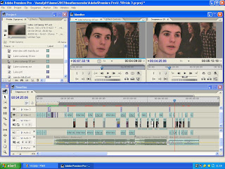
We edited his cutaways making them shorter and better, we added them into his interview as good mise-en-scene also it is a good way to aviod jump cuts in the documentary.
Underneath to keep the audiance anchord we used music, we used music that when with the subjet of the documentary. We used Bodies by Robbie Williams and we had to edit the sound higher and lower to fit in with the iterviews, we used bodies underneath the interview for Amanda.
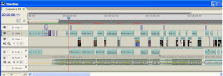
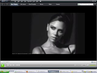
We found achieve material off the ineternet we used these as cutaways during the interview with Amanda and Luke.
We used Victoria Beckum as Amanda said that she was her idol.
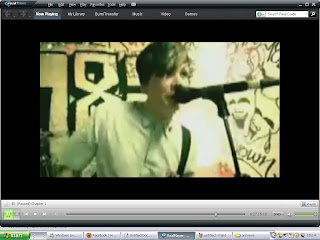
Also using Archieve of Tom Delonge for luke as he said he was the reason he painted his nails black.
We also used pictures off the internet to show that makeup is becoming more popular for famous men aswell as ordinary men.

Russel Brand, Known for his big hair, eyeliner and being very outspoken.


We made each sin flash up as it is a series of documentaires making pride fade into the fire. Changing the colour of the fire, to make it seem more deadly and also to make it look different, we needed it to be a colour that did'nt clash with red as 7 DEADLY SINS is written in red, so we chose an orange colour as the two colours go without it being to much. Then fading the fire into black and Pride fading in, we choose purple as it is the traditional colour of pride accoring to our reasearch.
We edited the Vox Pops that we filmed in Liscard, making them better and then also used these in our beginning sequance. We used them at the very begginning of the title sequance. We did this in order to grab the audiances attension.

After this we began to edit Amanda's interview cutting out the questions just leaving the answers avioding jump cuts.During Amanda's interview we decided to use the boots cutaway so we edited it down to fit into the interview, we also speeded it up.

We experimented with a few of the cutaways that were filmed but none of them seemed to fit, so a member of our group volenterd to take a camrea and experiment with diffrent things that she may be able to do at home that we could use in the documenary, so she did and she came back with a couple of things that we have used she recored makeup dropping on a bed and someone putting lipstick on.
We edited Luke's interview, we edited out tehe questions to avoid jump cuts as we had done in the other interview.

We edited his cutaways making them shorter and better, we added them into his interview as good mise-en-scene also it is a good way to aviod jump cuts in the documentary.
Underneath to keep the audiance anchord we used music, we used music that when with the subjet of the documentary. We used Bodies by Robbie Williams and we had to edit the sound higher and lower to fit in with the iterviews, we used bodies underneath the interview for Amanda.

We found achieve material off the ineternet we used these as cutaways during the interview with Amanda and Luke.
We used Victoria Beckum as Amanda said that she was her idol.

Also using Archieve of Tom Delonge for luke as he said he was the reason he painted his nails black.

We also used pictures off the internet to show that makeup is becoming more popular for famous men aswell as ordinary men.

Russel Brand, Known for his big hair, eyeliner and being very outspoken.
Because the music that we used in our documentary was by professional artist we had to make sure that it was ok with there producers so we sent an email to each of the artists producers asking for permission.
Subscribe to:
Comments (Atom)

